The blog ·
Logo redesign: when should you redesign your company’s logo, and how?

Your logo has been with you for years. Should you redesign it, modernise it, or keep it as it is? A logo redesign affects what your customers recognise about you at first glance: it’s a decision that needs to be made carefully and requires thorough preparation. Here’s how to work out if it’s necessary, and then how to go about it.
Eight signs that your logo needs a redesign
Before you start, make a list of what’s wrong with it. This will tell you whether you need a complete redesign or just a simple refresh.
Your business is changing its name
This is an obvious case: a new name means a new brand, and the logo must be completely redesigned so that the public can distinguish the old company from the new one.
Your logo isn’t clear
If you’re often asked, ‘What does your logo represent?’, and you have to explain it every time, its message isn’t getting across. It may be too complicated, overloaded with detail, or unrelated to your business. A logo must have a strong connection to the company: it is its brand image.
You’re offering new services
Some logos represent a single service. If the company adds others, the logo must suit the whole range. If you’re planning to expand, it’s better to have a logo that isn’t tied to any particular service.
Your business has evolved
Logos are often designed based on what we dream the business will become. As the business grows, the logo no longer reflects what it has become. A merger with another company is also an opportunity for a redesign, signalling the change.
Your logo doesn’t look professional
A logo must show your customers that they can trust you. An image taken from a clipart library, a fanciful font with no connection to your line of business: it’s time to entrust the work to a graphic designer, before customers turn away after just a glance.
Its design is outdated
A 1980s-style typeface, an embossed effect that’s gone out of fashion: your logo needs a redesign. But don’t just follow trends for the sake of it. Keep your logo as long as it’s effective and true to the spirit of the business: today’s trends are tomorrow’s clichés, and a logo designed to be fashionable will quickly become outdated.
It isn’t versatile
A good logo works in black and white, remains legible when scaled down — on a mobile phone, in a browser tab — and doesn’t use too many colours, so it doesn’t cost a fortune to print on clothing, a mug or a vehicle. If yours is expensive to print or becomes illegible when scaled down, a redesign is needed.
It looks like another logo
This happens, often by accident. If your logo is mistaken for that of another company, change it: you risk being seen as a copycat, especially if the other company is better known than you.
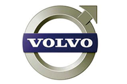
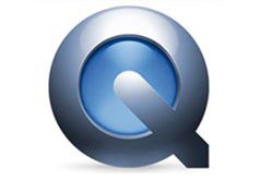
An example of a similarity: Apple’s QuickTime video player and the Volvo brand.
Six tips for a successful logo redesign
Start with the company’s values
Every company has its own values. Start by making a list of the words that best define it, and design the logo on that basis: at a glance, the public must understand what you mean.
Look at your competitors
Observing is not the same as copying. It’s about understanding how your competitors present themselves and how their audience reacts to them. If their logo is weak, do better; if it’s effective, understand why, and find your own way to achieve the same effect.
Take stock of your business
- What changes has it undergone?
- Have its services evolved?
- Does it have more staff than it did at the start?
- Is it targeting a wider audience?
The new logo must reflect this growth.
Think about online use
Nowadays, most people discover a company online. Your logo must look crisp at all sizes, be quick to load, legible against both light and dark backgrounds, and recognisable within the small circle of a social media profile.
Stay consistent
The logo, typography, website, colour palette, images and messaging must all form a cohesive whole: it is consistency that builds a strong identity. This is the role of the brand guidelines, which accompany the logo.
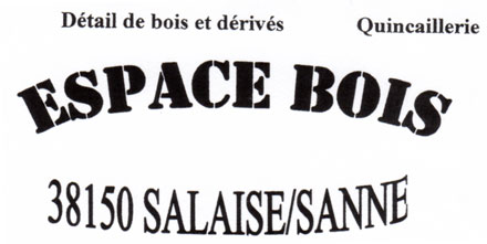
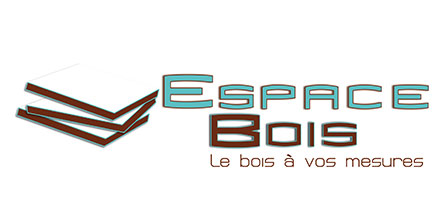
For Espace Bois, our graphic designer has redesigned the logo and added a tagline that succinctly describes the company’s line of business.
Maintain your brand identity
Your brand embodies your customers’ trust. It is important to preserve this during a redesign, so that the logo remains recognisable: keep the colours, the font style or a few elements from the old design. This is what distinguishes a refresh from a complete redesign.
If a completely new logo is needed, let your customers know before the change. Yahoo! turned it into an event in 2013: thirty days, thirty different logos, before unveiling the final version.
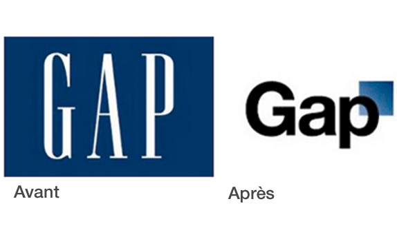
Not all redesigns are successful. Gap learnt this the hard way in 2010: its new logo met with such a backlash that the brand reverted to the old one in less than a week. A redesign needs to be planned, tested with a few customers, and properly explained.
Have your logo redesigned with AmaZili
Our graphic design studio designs logos and carries out logo redesigns, ranging from a simple refresh to a complete new visual identity: see our logo redesign service.
This post is loosely based on an article by Kareen Liez. To see how famous logos have evolved, read the story of their evolution (in English).